Having decided what to measure, identified suitable proxies, defined the Proxy Hypothesis, understood the accuracy and precision or the measurements, identified errors and – where possible – corrected them, it is possible to begin the analysis and simulation. Both require measurements: analysis is performed directly on the measurement data, whereas simulation uses the measurements for configuration and/or calibration.
The methods and examples illustrated below are to be used by an analyst in studying, understanding and extrapolating the measurements obtained. This specialized activity requires a high degree of numerical competency and familiarity with the subject area.
These methods contrast results incrementally often building on earlier results and ultimately always from the foundations of measurement. They do not in and of themselves provide insight into what to do, or which scenario to choose – although they can of course be used to support those kinds of decisions. However, this section is focussed on what can be inferred or deduced from the measurements taken independently of what ultimate purpose the analysis may be put to. For the application of the analysis to decisions making, see the next section on reporting and evidence.
Analysis
There are many analyses that can be performed using the range of measurements that have been defined. The analytics that should be used depend on the measurements that are available and the kind of evidence required or decisions to be made. The following sections explore just a few of the more common and perhaps useful occupancy analyses, and provide some potential uses and considerations for use.
Building occupancy summaries
Perhaps the most common analysis that is performed is Occupancy. Understanding occupancy is the basis of both Utilization and Availability, and provides insight into what people have actually done in the past.
There are four basic types of Occupancy: Allocated Occupancy, Assigned Occupancy, Physical Occupancy, and Trace Occupancy. See occupancy and utilization and types of occupancy for more details on the differences between these.
Day of week summary
The chart below shows how the total Occupancy of a particular building varies depending on the days of the week. The data is based on a measurement of Occupancy (the number of different people in the building each day) obtained from a range of proxies (for example badge data, reservation data and IPDD data), and corrected accordingly.
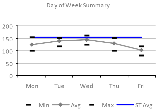
Shows minimum, average (mean) and maximum Occupancy over the analysis period with the uncalibrated ST Simulation estimate of the mean Occupancy.
The shape of the average Occupancy curve (grey above) is very typical off office space: Tuesday and Wednesday usually have higher Occupancy, with Mondays and particularly Friday the lowest. The minimum and maximum Occupancy in the period being analyzed also show similar shapes, although these are more susceptible to outliers – for example a particularly high occupancy due to a one-off or irregular event.
This type of analysis is useful for understanding peak and high-load on a building, and also days when the building is less used. This information could be used to adjust supply of everything from food to HVAC to cleaning services.
Weekly occupancy summary
Another similar Occupancy summary is to look at the minimum, average and maximum for each week during the analysis period, as shown below:
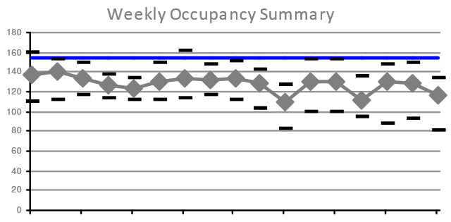
Shows minimum, average (mean) and maximum total Occupancy (based on daily totals) for each of seventeen weeks in the analysis period.
The key is the same as the chart above.
This is useful for understanding any variations due to longer term business cycles, like monthly, quarterly or longer cycle events. It is also useful for understanding the impact of personal time off/leave on attendance patterns: the first of the two low mean Occupancy (and the lowers maximum Occupancy) occurred during a week when the local schools were on holiday.
Occupancy by hour of the day
Whilst the first two examples above consider the whole day, it is also interesting to look at Occupancy within a day. The chart below shows the peak Occupancy for each hour of the day, with a separate curve for each of the five working days of the week:
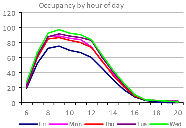
This is useful for profiling the likely times during the working days when there might be congestion – i.e. excessive demand for space or services. The profile above shows a relatively even distribution of arrival times between 6am and 9am, and this will likely spread the demand for “on-arrival” services like coffee or lifts/elevators.
Departures in this particular case show a steady exodus from lunchtime through to around 5pm. This suggests a work style for the 200+ people using the building that prefers or encourages attendance in the morning – possible in preparation for afternoon’s offsite, or to attend to team based activities. If it is team focussed, then we might expect to see a demand for meeting space that is disproportionate to Occupancy. Such a finding – if substantiated – would undermine the typical workplace planning assumption that the amount of meeting space (Resource Count and Capcity) is driven linearly by the Occupancy.
Average time on site
An alternative way of looking at Occupancy is to consider how long each Occupant is remaining on site each day. One way of measuring this is to look at the time between each occupant’s first presence in the building and their last. Such a chart is shown below:
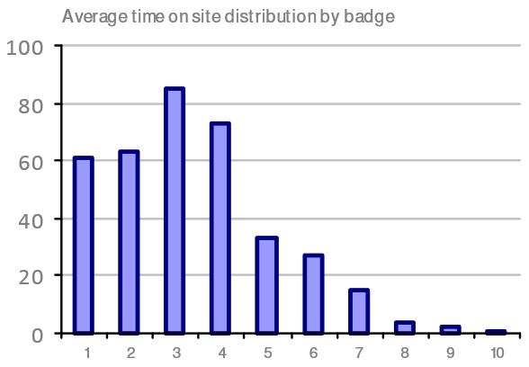
Shows how many occupants (from a total of approximately 360) spent the given number of hours on site, based on the time difference between their first and last measured presence, using access control badge data.
Again, this is useful for profiling attendance, but in this case considering dwell time in the building rather than any consideration of at what time of day the Occupancy is occurring. The example shows that well over half of the occupants spend 3 or fewer hours each day in the building on average. This might indicate that there is a need for fairly short-term working spaces (e.g. touch-down space) or potentially that these occupants are predominantly coming in to the office for meetings.
NOTE: Interpreting these charts takes practice: the chart shows approximately 60 badges attending for 1 hour or less. However, this is not saying that those are the same 60 badges each day, and therefore nor are they the same occupants each day.
Organizational unit demand
In very many contexts, it is insufficient to consider only the overall building occupancy. Instead, individual teams, departments and functions that share the building must be considered both independently and in terms of their interaction. This kind of analysis often begins with high level analysis of team occupancy, for example that shown below:
This chart shows daily building Occupancy by team, and although it is not particularly useful for inferring anything too specific, it does provide some helpful context. The team represented by the solid pink line dominates the building occupancy, accounting for around 50%. Three other teams have 15 to 25 occupants each day, and the remaining four teams have ten of fewer occupants during the analysis period. This is the simplest expression of the demand for space and services from each team.
Looking a little more deeply, the Occupancy data can be compared to the number of workstations that have been allocated to each team. One way of presenting this is shown below. On the left, the Summary of Team Attendance chart show four bars for each team:
- the headcount in that team (grey) – usually obtained from HR;
- the number of workstations allocated to that team (white) – usually provided by the CAFM system;
- the peak workstation reservations made by occupants who belong to that organizational unit (light blue), whether or not those occupants are actually assigned to this building or not (i.e. including visiting occupants from other buildings who are assigned to the same organizational unit, e.g. finance); and
- the peak number of badges seen during the analysis period that are held by occupants who belong to this organizational unit (dark blue).
On the right, Minimum Surplus WS shows the surplus (bars extending right from the centre line) or shortage (bars extending left from the centre line) of workstations allocated to each team when compared to the peak number of occupants from that team seen during the analysis period. The light blue bars show the difference between allocated workstations and peak reservations; the dark blue between allocated workstations and peak badges.
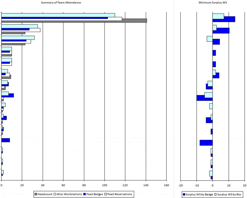
These kinds of analysis can be extremely useful when identifying where to dig deeper into the occupancy patterns. In the example above, the first team (top set of bars) has a headcount of just over 140, and approximately 115 workstations allocated. This is a Density of 1.22 people per workstation (assuming the Capcity is based on the number of workstations Allocated to that team).
Whilst such a ratio may appear reasonably efficient – certainly when compared to the next two team who have more workstations than people – the chart on the right shows that based on both reservations and badge data there are surplus workstations for this team even during the peak occupancy. Conversely, the third team has more Allocated workstations than Assigned people, and yet has more reservations that workstations, and indeed more badge-based occupancy than Assigned Headcount.
Similarly, two teams farther down have significant shortages of workstations (circa 10) based on badge data. One of these teams has no Allocated workstations and no Assigned Headcount, and the other only a couple of workstations and a couple of Assigned Headcount. These situations cannot be seen from CAFM and HR data alone, and are often masked when occupancy is determined at building or floor level rather than by team. Apparently these teams have unusual occupancy patterns when compared to the other teams in this building, and should be investigated further. The data may be caused by teams who are largely field based and therefore are not Assigned to the building or workstations, but perhaps come on site once a month for a team meeting or briefing.
Another explanation may be that the team has moved in to the building but the underlying HR and/or CAFM data has not yet been updated. This kind of potential error should be detected by a Reasonableness test.
Correlation and conformance
As discussed in error detection and correction, correlating different data sources is a very valuable method of dealing with errors. While attempting to understand the nature of the errors, it is very helpful to have analytics specifically designed to illustrate how and when the various data sources correlate.
The chart below show badge data (grey line) against reservation data (which is split between workstations/desks and offices, and shows both long-term/permanently assigned and short-term/’on-the-day’ reservations). The chart also shows reservations that were ‘bumped’ (automatically cancelled) when the reservation owner failed to check-in to their reservation.
This chart provides a good initial starting point for considering the correlation between the badge data and the reservation data. If everyone who badged in to the building had a reservation, and if everyone who had a reservation badged in, the stacked bars showing the various reservation types should exactly match the grey line showing badge counts.
However, in this example, these do not always correlate well. In the first three weeks it is commonplace for the reservations to exceed the badge count, indicating that more people are making reservations than are actually attending. Conversely, towards the end of the analysis period, there are several weeks where the number of badges seen almost always exceeds the number of reservations made. There are a few weeks in the middle where the two proxies do closely correlate.
To investigate what is going on here a bit more, other analysis may be required. For example, the chart below shows the different on each day between the number of reservations made and the number of badges seen. Zero would mean that there is an exact match between these two measurements; positive indicates more reservations than badges; and negative indicates more badges than reservations.
Two things can be seen immediately from this chart:
- There is a clear overall downward trend (which confirms what seemed apparent in the first chart); and
- The difference varies considerably from day-to-day.
Both of these observations are interesting (and arguably necessary) to understand, and further analysis can yield useful insights. Trends are always important, and prompt often vital questions: what is the underlying cause of the changes over the analysis period? Is this trend part of a cycle (where only one piece is seen in the analysis period) or is it one-way? Has the change stopped, or is it likely to continue?
To answer these questions, analysis must be targeted on the underlying factors. In this example, another useful visualization is to focus on how the different types of reservations (long-term vs short-term; office vs desk) vary over the period:
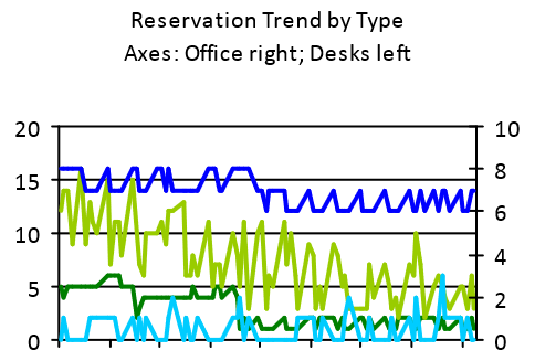
There are a few possible inferences from this chart:
- Both long-term desk reservations (dark green) and long-term office reservations (dark blue) appear to step-down just before the middle of the period. This suggests some change was made and people who previously had a permanently assigned office or desk where changed to making daily reservations.
- The on-the-day desk reservations – which make up the majority of the total reservations – seem to exhibit a similar trend to the reservations minus badges chart shown earlier, and indicate a declining number of on-the-day reservations for desks. Given that there is no significant corresponding decline in badge-based occupancy, this would suggest that people who were making desk reservations in the early part of this period progressively became less and less likely to as time went on. This might reflect no apparent benefit to the individual in having made a reservation, possibly because the relatively low occupancy compared to Capacity combined with how unassigned seating preferences typically work in practice (see workstation sharing worked example) meant that people could sit wherever they wanted without the need to make reservations (an example of a system that is not Operationalized).
- The on-the-day office reservations do seem to increase slightly, perhaps corresponding to the reduction in permanently assigned offices (i.e. this may be the people who used to have a permanently assigned office now making office on-the-day reservations). However, this is such a small number (3 or fewer) that it is difficult to draw safe inferences from.
Another useful perspective comes from visualizing the correlation semantics – i.e. showing which business rule or heuristic is being applied to determine a measurement from the participating proxies. In the chart below, the measurement is occupancy at some point during each day, and three rules (or proxy hypotheses) are being considered:
- Occupancy is determined by both a badge presence event and a reservation;
- Occupancy is determined by a badge presence event (even when there is no corresponding reservation); or
- Occupancy is determined by a reservation (even when there is no corresponding badge presence event).
This shows that only a little over half the time is occupancy determined by both a badge event and a reservation. This should cause further investigation to understand the situations in which only one presence event is being seen, and, if necessary, adjust the Proxy Hypothesis being used accordingly.
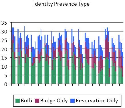
The previous correlation charts have all used a time-series representation. This is useful for exploring how behaviours vary over time, but it is not the entire picture. Another perspective is to consider how individuals have different behavioural patterns in the same space.
The chart above shows the overall attendance profile for 49 individuals (along the x-axis, anonymously). For each individual, the percentage of days during the analysis period that they were considered to be in the building is shown broken down by the basis of occupancy determination.
For example, the first six individual on the left all show 100% occupancy based on long-term (i.e. permanently assigned) office reservations. However, the corresponding badge data (grey line) suggests that these six individuals were not in fact in the building on every day, with the sixth individual not showing any badge swipes during the entire period.
The purple bars indicate presence that is implied by badge events but on days where the owner of the badge has no corresponding reservations. Three individuals have either no or hardly any days when they had reservations, so we can see that these three people are not making reservations despite moderate occupancy (50% – 75%).
Other individuals – around 20% of the individual occupants studied – show strong correlation between reservations and badges. These individuals are highly likely conforming to the intended use of the space and systems. It is important to understand that most “reporting” or “analytics” systems provided by vendors do not allow a Proxy Hypothesis to be stated, far less tested. As a consequence, their outputs typically can only be relied upon for the individuals who conform to the implicitly expected behaviour – e.g. everyone badges in and badges out, or people check-in if they are using a reservation and don’t otherwise. As these systems do not measure conformance (or test the Proxy Hypothesis), it is impossible to known how reliable these outputs would be, but as can be seen from the example above (which is based on real-life data), reliability for only 20% of the population would not be unexpected.
Occupancy frequency
In many analyses, as can be seen above, maximal or peak measurements are used for occupancy. This makes sense when considering the provision of space or space types: the usual objective is to ensure there is sufficient supply to accommodate the peak demands, so that there aren’t days when people are coming in to the office and are unable to find a desk to work at.
In other cases, average (usually mean) occupancy is used. For example, when determining the needs of services like catering or cleaning, the mean occupancy is far more interesting than the peak, as the peak might correspond to a spike in demand, but will not be useful in anticipating the overall demand. The average occupancy, on the other hand, will be a much better indication of the overall levels of catering, cleaning or other consumable services offered.
However, neither the mean nor the maximum occupancy tell the whole story. To understand the variation of occupancy another kind of analysis is required.
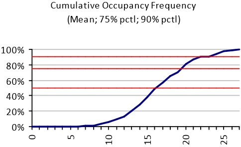
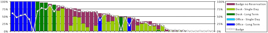
The chart above shows the cumulative occupancy frequency for a specific team in a building. The number of occupants is shown on the horizontal axis, and the frequency with which that number of occupants is not exceeded on the vertical axis. The 50th, 75th and 90th percentiles are shown by the red horizontal lines.
This chart provides the peak occupancy (27 occupants) and the average occupancy (17 occupants). However, it also shows the profile of the occupancy variation. The minimum occupancy is 6 (i.e. there are never fewer than 6 people from this team in the office).
This kind of profile can be used to provide softer boundaries at peak capacities. For example, in this case, there are never more than 27 of the 49 team members in the office on the same day. In the absence of other analyses to determine how many of the occupants actually need a desk at any one time (as opposed to some other space, like meeting rooms or the cafeteria) it may be desirable to cater for the worst case of 27 desks being required. However, if five of those desks were provisioned as, say, bench-style desks, we can see from the cumulative frequency chart that 90% of the time (9 days out of 10) this would be enough full size desks even if everyone in on those days wanted to work at a desk at the same time. This configuration may well not even need the 5 bench-desks on the peak days, because the peaks may – for example – be caused by meetings. Yet the five full size work stations can be replaced by bench-desks saving in excess of 10sqm/100sqft.
Simulation
Most research into the use of buildings relies on data collection form real buildings in use. It is possible to collect large amounts of detailed data, describing real-world settings.
Simulation studies, on the other hand, are highly simplified and artificial. Simulation sacrifices vast amounts of real world data in exchange for simplicity, control and experimentation.
Simplicity means reducing the number of variables in a model, so that their interactions can be studied and compared and understood. Three or four interacting variables is plenty; a model with more than five or six variables is too complex to understand and therefore self-defeating.
Control is a consequence of simplicity – the modeller can set the values of all the variables and observe the outcomes. This means that the modeller can carry out experiments by changing attribute values in a systematic way, revealing trends and patterns in the outcomes.
Experiments
Experimentation is easy for a modeller, but problematic for a case study researcher.
It is highly unlikely that it would ever be possible to find case study examples representing all the interesting permutations of key attributes in a research study, and even of you could the data would be ‘contaminated’ by other, extraneous variables (from the point of view of the experiment). So it is rarely possible to conduct systematic comparison between precise features of interest using as-found case studies.
Researchers are seldom able to intervene and make experimental changes in real case study situations. ‘Before’ and ‘after’ observations, such as when an organisation moves or redesigns its premises, are about the closest a case study researcher can get to experimentation. They are great research opportunities, but infrequent.
Hypothetical scenarios
A crucial benefit of simulation over case studies is that you can only observe settings that already exist, but with simulation you can study all imaginable buildings and use patterns.
In particular, you can model future scenarios. This is not the same as trying to predict the future, which is impossible, but it allows the probable consequences of alternative courses of action to be compared – something that is of immense value to managers and policy-makers.
Managers study past data to help make decisions about the future. What they need is forward projections. Up to now these have to be made intuitively or using simple extrapolations. Systematic simulation provides a far more powerful way of testing future scenarios.
Relevance
A weakness of simulation is that you can construct artificial worlds that bear little or no relation to reality. This is why the case study and simulation research approaches must communicate with each other.
Model predictions must be compared with case study data from corresponding real-world situations, so that the model can be verified and calibrated. Only when a model has been shown to replicate a variety of real situations, can its findings for hypothetical situations have credibility.
Model, calibrate and simulate
Simulation studies follow the long-established procedure of operations research. It begins by carefully observing and formulating the real-world problem of concern. The next step is to construct a model (typically mathematical) that abstracts the essence of the real problem. The model is run with input data derived from observation, and calibrated so that the model output corresponds to the real situation. Then it is hypothesised that the model as calibrated is a sufficiently reliable representation of the essential features of the real situation, that its conclusions are valid.
With the calibrated model, suitable experiments are conducted with input data that varies from the observations, to test scenarios for change that are of interest. The model output is believed to give a reliable indication of what would happen if these scenarios were applied in the real world.
ST – simulation of a modern organization
The ST (space-time) model is a simple but useful example of simulation modelling. It describes office-based organisations in terms of basic attributes that should be applicable in practically all situations. ST uses a simplified description compared to the incredible variety of the real world, but it has a specific purpose: understanding the use of space and time in a world where individuals have much greater freedom of choice about the times and places for carrying out activities. This decentralisation of decision-making brings unpredictability and complexity. Because individual decision-making is the critical factor, this is what the ST simulation model concentrates on.
The organisation to be modelled is described by the number of employees in nine employee types, defined by time and workstyle. In the time dimension, employees can be static, spending 90% of their working time at the employer’s premises; flexible, with 50% of their time on-site; or mobile with 20% of their time on-site (these percentages can be changed). The number of employees in each time category is input data for the ST model.
In workstyle, employees an be territorial, always using an assigned workspace that they ‘own’; or task-focused when they spend 75% of their time at the employer’s premises in bookable workspaces for individual work and 25% of their time in informal spaces for interaction; or interaction-focused when 25% of their time is in bookable workspaces and 75% in informal spaces (again, the percentages can be changed). The number of employees in each workspace category is also input data for the ST model. There are three workspace types – assigned (or allocated), shared (or bookable) and informal. The number of workspaces of the three types is the final element of input data for the ST model.
Running the ST simulation model
When the input data has been entered, the ST simulation program allocates employees to workspaces – effectively generating a ‘snapshot’ of the organisation’s premises in use. ST dies this many times, generating many snapshots, each one different, and the results aggregated to provide statistics for utilisation, displacement, overflow, etc.
Displacement occurs when there are insufficient workspaces of the types that people wish to use, and they are displaced to another type of workspace. If there are insufficient workspaces overall, there is an overflow. Displacement and overflow are the downside of space-saving: efficient facilities managers have to balance the attraction of space-saving against the risk (and cost) of displacement and overflow.
Using the ST simulation model
The office organisation described by the ST model can be real or hypothetical. It is normally run with real data to validate the output, and then used to compare alternative input scenarios, exploring trade-offs between maximum use, workstyles, utilisation, queueing, etc.
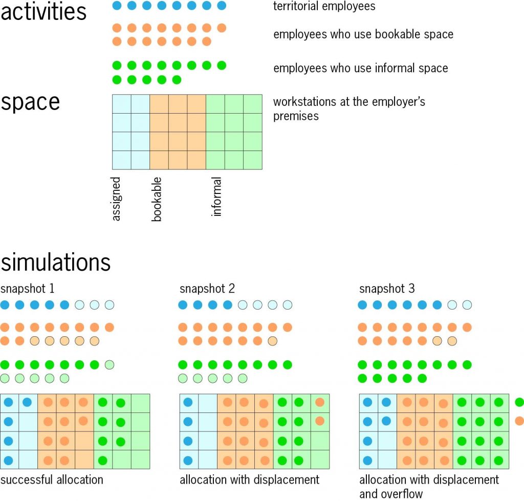
Two small examples illustrate ST. In the first, the diagram shows an organisation with 36 employees and 32 workspaces, of the types described above. ST generates a series of snapshots; three examples are shown in the diagram. It may be possible to make a successful allocation with everyone in workspaces of the type desired (snapshot 1); or some employees may be displaced to a different type of workplace (snapshot 2); or if all available workspaces are occupied there may be an overflow (snapshot 3). It is easy to re-run the model many times with varying input values, to investigate the impact of organisational or premises changes.
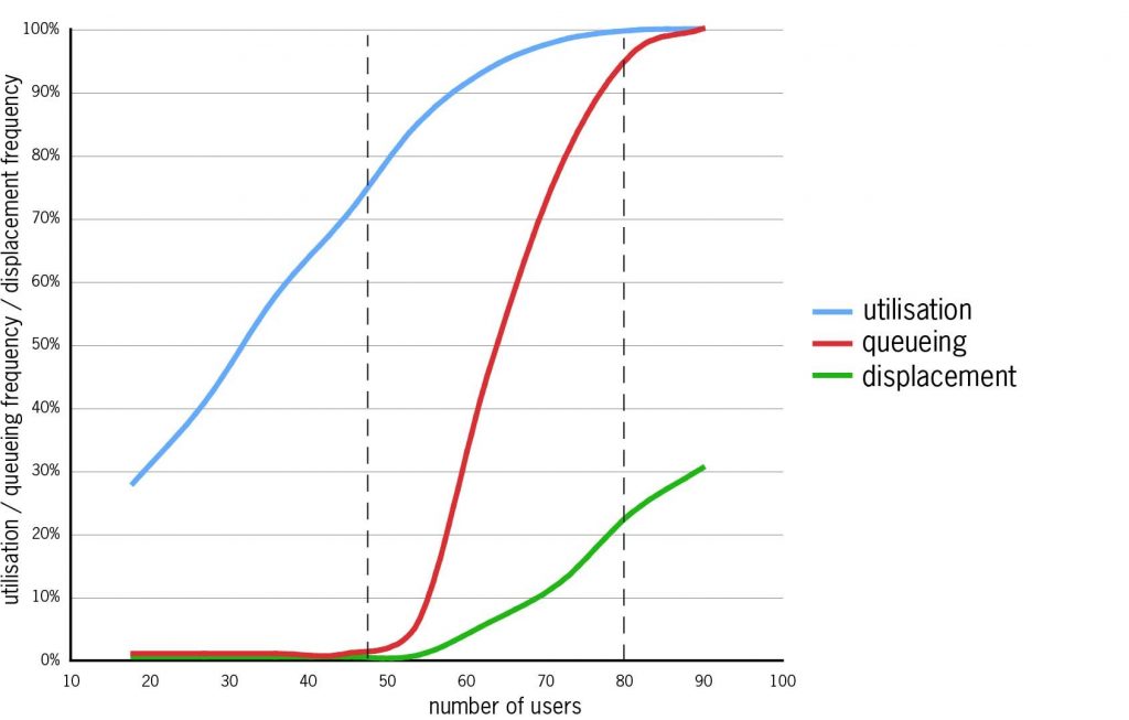
In the second example, the graph shows the results of an ST experiment. An organisation with 25 bookable workstations was simulated in a series ST runs, in which with the number of employees sharing the workstations increased from 18 to 90. One-third of the employees were static, one third flexible and one-third mobile; all were task-focused. The graph shows the results from these ST runs:
- Utilisation (blue line) rises steadily to 90% with about 60 employees, then more slowly to 100%.
- Queueing (red line – the probability that at least one employee will be displaced) never occurs for small numbers of employees, but from a threshold between 45 and 50, with utilisation at about 75%, it rises steeply.
- Displacement (green line – the probability of displacement faced by all employees) rises more gradually from the same threshold. With more than about 80 employees there is permanent congestion.
To avoid queueing and displacement, the upper limit on the number of employees sharing the 25 workstations is between 45 and 50, with utilisation at about 75% – under the assumptions of this simulation: other input data would give different results.
For facilities managers tasked with increasing workplace efficiency, the ST simulation model’s identification of the boundary between efficient working and crisis conditions is of tremendous value. Without knowing this boundary, the facilities manager is likely to set an unambitious target that fails to take advantage of potential efficiency gains, or an over-ambitious target that would be counter-productive if reached. Simulation modelling has immense practical value in workplace management.