In this example the starting point is data from a physical access control system. This data is already processed and summarized in to the total number of distinct/unique badges seen each day for working days Monday to Friday.
The chart above shows this summarized data. The first thing that jumps out about this is how it zig-zags up and down. This is due to the weekly variation – that is observed in almost every office – of high attendance on Tuesdays, Wednesdays and Thursdays and relatively lower attendance on Mondays and particularly Fridays.
This regular cadence makes it harder to see underlying variations, although it does allow us to quickly identify unusual days where the number of badge swipes is particularly high or low, such as the peak in mid-June where the number of unique badge swipes exceeds 1,800 for the only time in this period.
However, to see the trend, we need to try to factor-out this weekly cadence, and so a simple way to remove this is to include a 5-day moving average – that is to say the average of five consecutive days from each date. Including this yields a significantly clearer picture:
The orange line in the chart still shows some considerable variation, but it is now a little easier to see the significant jump in badge swipes in the middle of June.
However, there is still quite a lot of variability, particularly in July and August. Is this simply the normal variation in attendance, or could something else be going on? The next thing we can do to help remove noise from this picture is to look at the HR systems to see how many people were actually working – i.e. look at how many people had leave booked (PTO/holiday or sickness).
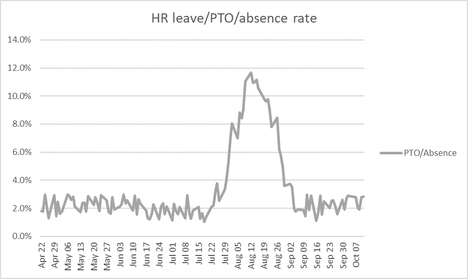
The chart above shows what percentage of the workforce were absent for one reason or another each day during the period. Unsurprisingly, this shows a clear increase during the summer months when people commonly take vacations.
This data can be used to adjust the raw badge swipe data to show what the badge swipes (and by inference, Occupancy) might have looked like if no one was absent:
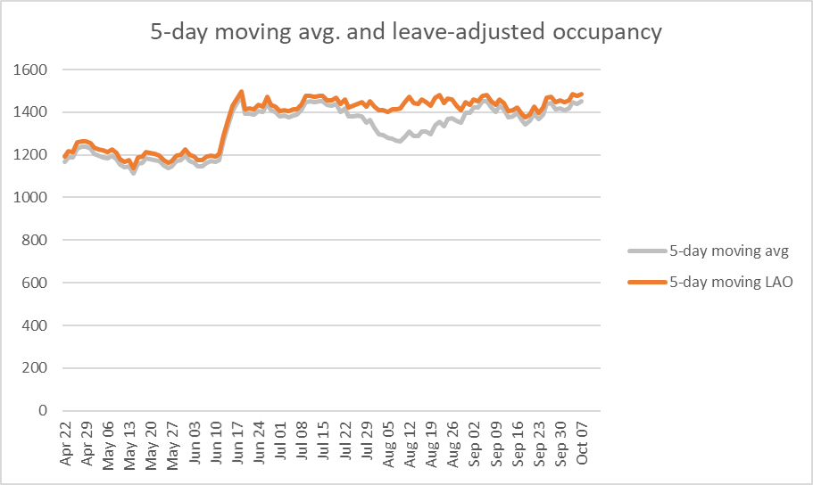
The original moving average is shown in grey and the new, adjusted, moving average is shown in orange.
Now that we have removed the ‘noise’ introduced by the natural weekly occupancy cadence, and corrected for the absences, we see a much clearer picture showing a sudden and sustained increase in Occupancy of around 20% in mid-June.