Utilisation and availability are related but distinct ways of looking at the relationship between the physical resources and the activities in an office. Utilisation focuses on the use of physical resources, whereas availability focuses on accommodating the activities. Availability is the more critical performance indicator.
Utilisation refers to the use of physical resources (space, desks, rooms, seat, parking spaces, etc) by activities. Utilisation compares the quantity of activity with the quantity of physical resources, measured in the same units. It is quantified by the ratio of activities to resources, and has a maximum value of 100% if all the resources are in use.
Suppose that:
the amount of physical resources = R
the amount of activities = A
then utilisation = A / R
In practice utilisation is always lower than 100% and it is tempting to regard the gap between the achieved utilisation and 100% as wastage, but this is a misunderstanding, as revealed by the concept of availability
Availability refers to the capability of physical resources (desks, rooms, seat, parking spaces, etc) to accommodate an activity demand. It is measured by the proportion of the activity demand that can be accommodated. If it can all be accommodated, then availability is 100%; but if a some of the activity demand cannot be accommodated, then availability drops below 100%.
Suppose that:
the activity demand = D
the activities that can be accommodated = C
then availability = C / D
The amount of the physical resource is not used in the calculation of availability.
A worked example shows the connection between utilisation and availability.
Suppose an office has 150 employees. Consider what happens to utilisation and availability as the number of workstations for use by the employees is reduced; in this example there is a mix of full-time and part-time employees, with attendance varying from day to day with an average value of 50%; that is, on average 75 employees attend the office but the precise number varies from day to day. This example is based on daily attendance at the office, not hour-to-hour activities within the office; it is assumed that when an employee attends the office he or she requires a workstation for that day.
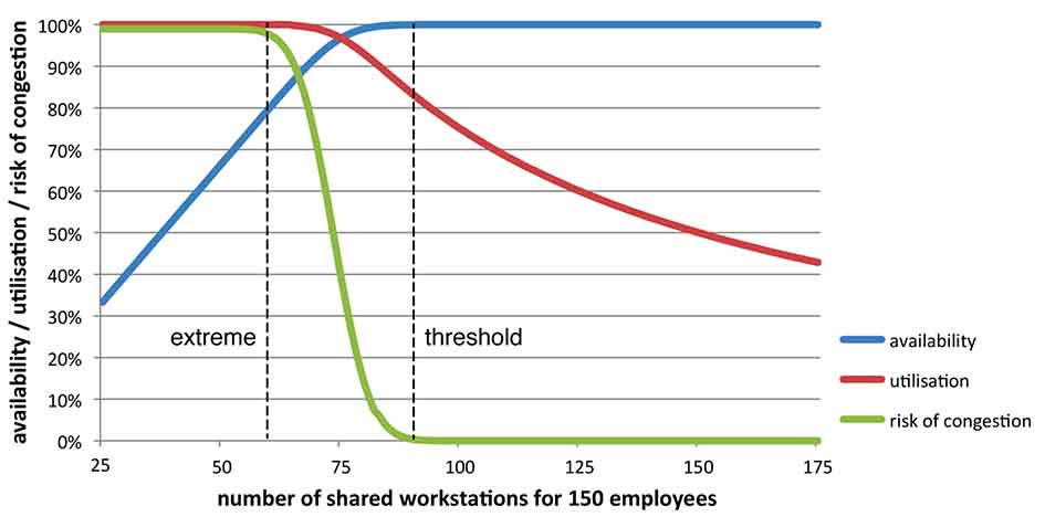
The graph shows the average values for utilisation (red) and availability (blue) as the number of workstation varies.
When the number of workstations is equal to or larger than the number of employees (150), availability has to be 100% (see the right-hand end of the blue line on the chart); but utilisation is low, about 50% (see the right-hand end of the red line on the chart). As the number of workstations decreases below 150 and desk-sharing is introduced, availability remains at 100% (blue line on the chart), but utilisation rises (red line on chart). Then, as the number of workstations decreases to a threshold value of about 90 workstations (marked with a dashed line), availability begins to drop below 100%; but utilisation continues to rise. As the number of workstations decreases beyond the threshold, availability continues to drop and utilisation continues to rise.
When the number of workstations being shared by the 150 employees decreases to an extreme of about 60 (marked with a second dashed line), utilisation approaches 100%, but availability drops to about 80%. Although 100% utilisation might sound good, 80% availability means that one-fifth of the employees coming to the office cannot be accommodated and have nowhere to work – a disaster. If the number of workstations is even lower than the extreme, utilisation remains at 100% but availability continues to fall.
The main driver for an effective premises manager is to ensure that availability is always at or very near 100% so that employees have somewhere to work. To achieve this there must be at least as many workstations as the threshold value – but it there is no availability benefit in having many more workstations than the threshold value, and this would be wasteful. However, it is not wasteful to have utilisation of less than 100% – it it is a requirement for maintaining high availability, which is the more important indicator for supporting business needs.
The graph also show a third line in green. This is the risk of congestion – the probability that at least one employee has nowhere to work because all the workstations are occupied. The risk of congestion is at or very close to zero when there are more workstations than the threshold value (right-hand end of the green line), but it rises quickly when the number workstations is lower than the threshold value. When utilisation approaches 100%, the risk of congestion approaches 100% as well.
The premises manager will get an irate phone call when as soon as an employee has nowhere to work – something that he or she would prefer not to happen; this is a good reason for keeping the risk of congestion at or very close to zero.
Above the threshold value, the risk of congestion is approximately a mirror-image of availability: when availability is at or very close to 100%, then the risk of congestion is at or very close to zero.
NOTE: The graph and the threshold and extreme values reflect the input data for the worked example. With other data values the same features would be seen, but the graph and the threshold and extreme values would vary.